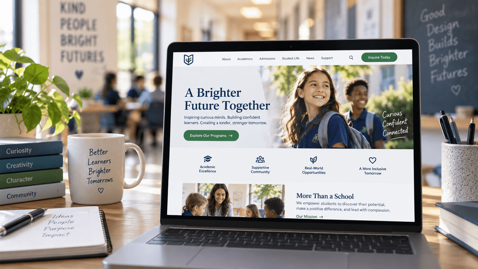
The Psychology of Website Design for Educational Institutions
'%3E%3Crect x='0' y='0' width='1024' height='576' fill='%2397948d'/%3E%3Cg transform='scale(4.00) translate(0.5 0.5)'%3E%3Cg transform='translate(175.43 135.91) rotate(99.25) scale(20.00 90.41)'%3E%3Cellipse fill='%230a070e' fill-opacity='0.50' cx='0' cy='0' rx='1' ry='1'/%3E%3C/g%3E%3Cg transform='translate(156.54 95.03) rotate(277.62) scale(20.95 76.33)'%3E%3Cellipse fill='%23ffffff' fill-opacity='0.50' cx='0' cy='0' rx='1' ry='1'/%3E%3C/g%3E%3Cg transform='translate(243.79 31.08) rotate(-16.99) scale(26.85 53.47)'%3E%3Cellipse fill='%23031123' fill-opacity='0.50' cx='0' cy='0' rx='1' ry='1'/%3E%3C/g%3E%3Cg transform='translate(123.29 59.24) rotate(226.00) scale(31.36 34.66)'%3E%3Cellipse fill='%23f7ffff' fill-opacity='0.50' cx='0' cy='0' rx='1' ry='1'/%3E%3C/g%3E%3Cellipse fill='%23fff2db' fill-opacity='0.50' cx='27' cy='0' rx='131' ry='27'/%3E%3Crect fill='%23000000' fill-opacity='0.50' x='157' y='55' width='69' height='24'/%3E%3Crect fill='%23000200' fill-opacity='0.50' x='0' y='77' width='32' height='35'/%3E%3Crect fill='%23201b17' fill-opacity='0.50' x='55' y='49' width='36' height='34'/%3E%3Cpolygon fill='%23fff7f3' fill-opacity='0.50' points='88,89 75,159 60,70'/%3E%3Cg transform='translate(154 24) rotate(179) scale(126 5)'%3E%3Crect fill='%23000000' fill-opacity='0.50' x='-0.5' y='-0.5' width='1' height='1'/%3E%3C/g%3E%3C/g%3E%3C/g%3E%3C/svg%3E)
A parent searching for a school makes a judgment about your website in under a second. Before they read your programs, your philosophy, or
your enrollment process, their brain has already decided how much to trust you. That judgment is not random. It follows patterns of human
perception that have been studied for decades, and every element of your school website either works with or against them. Understanding
those patterns is the difference between a website that generates enrollment inquiries and one that generates a high bounce rate.
Kreative Webworks · Updated 2026 · ~2,200 words · 7 min read
IN THIS GUIDE
- Why design psychology matters more for schools than most organizations
-
First impressions and the trust formation window
- Color psychology and what it signals to families
- Visual hierarchy and how parents actually read a school website
-
Typography and cognitive load
- Navigation, simplicity, and Hick's Law
- Social proof and the role of trust signals
- Mobile design psychology
- What all of this means for school enrollment
Why Design Psychology Matters More for Schools Than Most Organizations
For most businesses, a website conversion means a purchase, a form fill, or a phone call. The stakes are relatively low, and the decision
cycle is short. A school enrollment inquiry is a different kind of decision entirely. Families are choosing where their child will spend
years of their life. The trust threshold is higher, the evaluation process is longer, and the first impression carries more weight because
the emotional stakes attached to it are higher.
This is why a school website that simply looks modern is not enough. A school website needs to actively communicate trustworthiness,
clarity, and warmth within the first few seconds of a visit. Every design decision, from the colors used to the size of the navigation menu,
is either contributing to that communication or working against it. There is no neutral design.
First Impressions and the Trust Formation Window
Research consistently shows that visitors form an initial impression of a website in as little as 50 milliseconds, a timeframe so short it
precedes conscious thought. In that window, the brain is not reading your mission statement. It is processing visual complexity, color
harmony, layout structure, and image quality at a subconscious level. A cluttered layout, mismatched colors, or low-quality photography
triggers a negative impression that subsequent content has to work very hard to overcome.
For schools, this matters acutely because the families arriving at your website are often arriving at a moment of genuine deliberation. They
are not passive browsers. They are parents actively evaluating options for their child. A first impression that creates doubt, confusion, or
a sense of low quality does not just lose a click. It removes your school from the consideration set before a single word has been read.
What Creates a Positive First Impression
The psychological research on positive first impressions in web design consistently points to the same factors: visual simplicity, clear
purpose communication, professional image quality, and a sense of order. A school homepage that makes the primary question answerable within
two seconds, that question being whether this school could be right for my child, performs significantly better than one that requires the
visitor to work to understand what the school offers.
“A school website is not a brochure. It is a trust-building machine. Every design element either earns that trust or erodes it
before a family ever reads a word.”
- Kreative Webworks
Color Psychology and What It Signals to Families
Color is the most immediate psychological signal a website sends. It is processed before layout, before typography, before content. The
associations that colors carry are not arbitrary. They are deeply conditioned by cultural exposure, biological response, and prior
experience. School websites that choose colors strategically, rather than simply matching a logo or following a trend, communicate more
effectively with the families they are trying to reach.
What Different Colors Communicate
Blue remains the most consistently trust-associated color across cultures. Banks, schools, and healthcare organizations have long relied on
blue not because of tradition but because the psychological association with reliability, calm, and authority is well established. For
schools, blue or blue-adjacent palettes signal institutional credibility without the coldness that can come from gray-dominant designs.
Green communicates growth, safety, and possibility, which makes it particularly well-suited for schools that want to emphasize development
and nurturing alongside academic rigor. Warm tones such as gold or amber convey aspiration and warmth, and are often used by private schools
to signal a premium positioning without aggression. Red, while attention-commanding, is rarely appropriate as a primary school color because
its psychological associations with urgency and alarm conflict with the reassurance families are seeking.
Color family
|
What it signals to families
|
Blue / navy
|
Trust, stability, academic credibility
|
Green
|
Growth, safety, nurturing environment
|
Gold / amber
|
Aspiration, warmth, premium positioning
|
White / light gray
|
Clarity, organization, modern approach
|
Red (accent only)
|
Energy, urgency -- use sparingly
|
Dark gray / charcoal
|
Authority, professionalism, seriousness
|
PRACTICAL TIP
Your school's brand colors should inform, not dictate, your website color choices. If your brand colors carry psychological associations
that conflict with what families need to feel when evaluating your school, a subtle adjustment in tone, saturation, or supporting palette
can resolve the tension without abandoning the brand. Our school
branding services
address exactly this.
Visual Hierarchy and How Parents Actually Read a School Website
Human eyes do not read a web page in the same way they read a book. They scan. Eye-tracking research consistently shows that website
visitors use either an F-pattern or a Z-pattern to process a page, spending the most time on the top-left content area and progressively
less attention on content further down and to the right. A school website that puts its most important message, typically the school's core
value proposition and primary call to action, in the lower right of the page is working against the biology of reading.
Visual hierarchy is the design principle that deliberately structures a page so that the most important elements receive the most visual
attention. Larger elements are seen first. Higher-contrast elements draw the eye. Elements positioned at the top of the page and in the
center or left of the reading field get more attention than those positioned elsewhere. For a school website, visual hierarchy means placing
the enrollment call to action, the school's primary differentiator, and the trust signals in the positions where parents are most likely to
look before they decide to scroll or leave.
Size, Contrast, and Positioning
The three primary tools of visual hierarchy are size, contrast, and positioning. An oversized heading draws the eye first. A high-contrast
button stands out from its background. A prominent position at the top of the page signals importance. When these three tools are applied
consistently, parents are guided through the page in the order the school intends, rather than scanning randomly and missing the most
important messages.
Typography and Cognitive Load
Cognitive load is the psychological term for the mental effort required to process information. High cognitive load produces frustration,
fatigue, and abandonment. Low cognitive load produces clarity, confidence, and action. Typography is one of the most direct levers available
for managing cognitive load on a school website.
A font that is too small forces effort. A font that is too decorative reduces legibility. A font that is inconsistently applied, different
sizes, weights, and families across different pages, creates visual noise that the brain has to resolve before it can absorb content. For
school websites, where the audience includes parents reading on phones during school pickup, on tablets at home, and on desktops at work,
typography decisions made at a desktop design scale frequently produce a worse experience on the device most families actually use.
Practical Typography Guidelines for School Websites
-
Body text should be a minimum of 16px on desktop and 15px on mobile. Smaller than this produces measurable drops in reading comprehension
and time on page.
-
Limit the number of distinct font families to two: one for headings, one for body text. More than two creates visual complexity without
adding meaning.
-
Line length should fall between 50 and 75 characters per line. Lines that are too long increase reading fatigue; lines that are too short
break reading rhythm.
-
Sufficient line spacing, typically 1.4 to 1.6 times the font size, reduces the visual density that causes readers to scan rather than read.
-
Heading hierarchy, H1 then H2 then H3, should be visually distinct enough that a parent can skim the page and understand the structure
without reading the body copy.
Navigation, Simplicity, and Hick's Law
Hick's Law is a psychological principle that states the time it takes to make a decision increases proportionally with the number of
available choices. Applied to school website navigation, this means that a menu with twelve top-level items forces parents to work harder to
find what they need than a menu with five. That additional cognitive effort is not neutral. It produces frustration, and frustration
produces exits.
The most effective school website navigation structures reflect the actual journey a prospective family takes: finding out what the school
offers, understanding who it is for, seeing evidence it delivers on its promises, and then taking the next step. Navigation that is
organized around the school's internal structure rather than around the parents' questions creates a mismatch between the visitor's mental
model and the site's structure. That mismatch is one of the most common reasons school websites fail to convert interested families into
inquiries.
The Paradox of Choice on School Websites
When a parent arrives at a school's homepage and sees a navigation bar with Academics, Programs, Campus Life, Athletics, Arts, Student
Services, Parents, Alumni, News, Events, Admissions, and About Us all competing for attention, the psychological response is not engagement;
it is overwhelm. The paradox of choice, a well-documented psychological phenomenon, shows that more options consistently produce lower
satisfaction and lower conversion rates than fewer, well-chosen options. Every item added to a school's navigation that is not oriented
toward a prospective family's immediate question is potentially losing an enrollment inquiry.
WATCH OUT
Review your school website's navigation with this question: would a parent who has never heard of your school be able to find your
enrollment information within two clicks? If the answer is no, the navigation structure is costing you inquiries regardless of how strong
your content and design are.
Social Proof and the Role of Trust Signals
Social proof is the psychological principle that people are strongly influenced by the demonstrated choices and endorsements of others who
are similar to them. For school websites, social proof is the mechanism that converts a parent who is interested into a parent who is
confident. Testimonials from current families, student outcome stories, enrollment numbers, accreditations, awards, and media mentions all
function as social proof. They tell prospective families: other people like you have evaluated this school and chosen it, and this is what
they found.
The positioning and specificity of social proof matter as much as its presence. A generic quote stating that the school has a wonderful
community carries almost no persuasive weight. A specific testimonial from a named parent describing a concrete outcome for their child, the
improvement in their daughter's confidence or the quality of the college prep support, carries significant weight because it provides
evidence rather than assertion.
Where to Place Trust Signals
Trust signals perform best when placed at decision points, specifically the moments in a parent's journey through the website where they are
most likely to evaluate whether to continue or leave. The homepage hero section, immediately below any primary call to action, and on the
enrollment or admissions page are the three highest-impact placements for social proof on a school website.
Mobile Design Psychology
Over half of all school-related website searches now happen on mobile devices. A parent researching schools during their commute, at a
coffee shop, or while waiting for their child after an activity is using a phone, not a desktop. The psychology of mobile design is not
simply desktop design made smaller. It involves meaningfully different behavior patterns, attention spans, and interaction models that
require deliberate design decisions rather than responsive scaling alone.
On mobile, thumbs navigate rather than mice. The bottom third of the screen, within easy thumb reach, is the most ergonomically natural
interaction zone. Buttons that require a precise tap on a small target create friction. Text that requires pinching to zoom signals a site
that was not designed for the device being used, which is itself a trust signal, just a negative one. For schools, where the primary
conversion action is a form submission or a phone call, the mobile path to that action needs to be as frictionless as the desktop path, and
often more so because mobile contexts involve more distractions and less patience.
What All of This Mean for School Enrollment
The principles covered in this guide are not aesthetic preferences. They are documented patterns of human perception and behavior that have
predictable effects on whether website visitors trust what they see, stay long enough to read, and take the action you want them to take. A
school website that applies these principles consistently does not just look better. It converts more of the families it reaches into
enrollment inquiries.
Most school websites are not failing because of bad content. The mission is compelling, the programs are strong, and the staff is excellent.
They are failing because the design is not giving that content the psychological conditions it needs to be believed. Parents who might have
enrolled are leaving the site unconvinced, not because the school is not right for their child, but because the website did not make the
case clearly enough in the time they gave it.
A free website audit is the clearest way to identify exactly
where your school's site is losing families before they reach your enrollment page. If a redesign is the conclusion, our school
website design service is built specifically around these enrollment conversion principles.